tl;dr
You can now switch to Dark Mode and verify the TYPO3 compatibility of each tutorial. Also, the designer in me went overboard.
Introduction
The first layout of my blog didn't quite fit the tutorials, which became increasingly extensive after a while. That is why I created a new version at the beginning of 2018, which focused on readability and semantics. The design of the website was rather boring simple. I had been planning to change this for quite some time now.
The new design ought to have a clear recognition value. I wanted it to be more playful and with little gimmicks. In the end, this website remains my personal playground.
I think I accomplished these goals with this version, even if some things have to be further improved. For example, the bird animation should not be stopped so abruptly (and the wing position in Safari should be reset).
Thus, this is currently the beta version of the new website.
What I learned and did
Know your audience
As you're web developers which use modern browsers only, I finally had the chance to use all the fancy frontend technologies that only the cool kids in the internet play with!
In my daily work I primarily maintain B2B websites, where Internet Explorer 11 is still relevant. On this website, however, I only need a few browser prefixes to ensure proper display. No unnecessary ballast, yay!
Furthermore, you visit this website almost entirely with very high screen resolutions. Understandable—usually, you visit to answer a technical question during working hours and won't do that from your smartphone. Therefore I tried to make better use of the available space. The line length of the body text is still limited, which is beneficial for the readability.
Indication of TYPO3 compatibility
usetypo3.com has it, Daniel Siepmann as well, the official TYPO3 documentation anyway: a clear indication for which TYPO3 version a manual is valid. Pretty handy to ensure that a solution is compatible with your current project beforehand.
The new design allowed me to restructure the metadata of the tutorials, so that TYPO3 compatibility could be included. To assign the TYPO3 versions, I added a new database table for these tags and a multiselect field for blog pages.
I recently added the date of the last update to tutorials. This is also meant to show you the validity of an article.
Color scheme switch (a.k.a. 'Dark Mode')
I prefer to read long texts in dark writing on a light background. But the more time I spent in the Dark Mode of my website, the more I like it. Besides, I always use a dark theme in my text editors. Hence the generally dark code blocks in the tutorials.
Implementing the Dark Mode was a great opportunity to check out CSS variables (or rather Custom Properties).
By default, the prefers-color-scheme media query is used to detect the operating system's color scheme setting. If you use the color scheme switch, JavaScript will store your choice in the browser's Local Storage.
During the implementation of the color switch, I noticed that my original design was a bit too varied. The number of Custom Properties would have been too large. With the reduction, I also simplified the design a bit. For some elements, such as the alert boxes, I worked with transparencies to make them fit for both color schemes.
The Custom Properties are useful for more than just color assignments:
- In the news list view I was able to set different colors to the colored edges without having to repeat all values of the gradients.
- When animating the bird's feathers, I set the various degrees of rotation via a variable, so that a single @keyframes rule is sufficient.
Adaptable website templates and themes

The switch to the blog extension in April allows me to assign different templates to my articles via BackendLayouts. These templates can significantly influence the design of the site.
I have split my stylesheets:
- First, a small theme stylesheet with the Custom Properties is loaded.
- Then follows the main stylesheet, where the Custom Properties are applied.
By assigning a BackendLayout to a page, I can replace the first stylesheet with the default theme. This allows me to assign different themes. The themes can set different colors for the page and its content, or add new styles for a template as needed. Every theme, of course, supports the two color schemes (light and dark).
To control the classes in the header and footer of the website as well, I render the corresponding partials in each Fluid template. Here I pass the desired class names as additional arguments to the partials.
<!-- In template 'NewsDefault.html' -->
<f:alias map="{footerClassList: 'c-site-footer  c-site-footer--halftone  c-site-footer--skew'}">
    <f:render partial="Site/Footer" arguments="{_all}"/>
</f:alias>


<!-- In partial 'Footer.html' -->
<footer class="{footerClassList}">
    <!-- Footer content -->
</footer>
I have created an alternative blueprint theme this way, that I intend to use for news articles about my open-source projects. The page about me has a black & white theme assigned. I will create another theme for TYPO3-related news articles when I find the time.
 on a tutorial page")
 for news articles about my open source projects")
 on the page about myself")
Achievements unlocked: knowledge++
For professional reasons, I had to focus on TYPO3 CMS and several other topics for the last years. New features in CSS were somewhat neglected—also because IE 11 will not support most of them. With this relaunch, I was able to catch up on a lot.
Besides the CSS Custom Properties, I have mainly been studying the more advanced possibilities of Gradients. In March, I attended a talk by Ana Tudor about Gradient Blobs and Halftone Effects, which sparked my interest. It was the foundation stone for the halftone effect in the header.
I also used more complex gradients for the colored corners in the news list and the graph paper background of the blueprint theme. The hover effect on links is also an animated gradient. A versatile tool!
Other topics I wanted to explore or deepen for some time now:
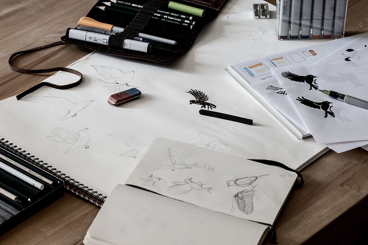
- SVG. Some of my graphics are now stored in a SVG sprite and then used in the template with the <use> element. I also learned that SVG has an own syntax for animations: SMIL (Synchronized Multimedia Integration Language).
- Animations. The bird is an inline SVG whose eye blinks periodically thanks to SMIL. For the flying animation on hover/focus I rely on CSS animations.
- CSS Grid. Currently I use this only for minor parts: the tutorials' metadata is sorted with a grid. If some data is missing (e.g. the date of the last update or the TYPO3 compatibility), the other entries remain at their defined place in the layout.
Small things that take time
Much of the work is not visible at first glance. For instance, I also adjusted the browser's scrollbars. Not because I so wanted to do that, but because the default design in dark mode looked out of place (e.g. the horizontal scrollbars in wide code blocks).
I invested about two hours to create a scrollbar Sass mixin for cross-browser support. This includes the initial research for browser compatibility and writing comments on how to use the mixin, though.
Snippets wiki (german only)
The german version of this website contains a Dokuwiki with code snippets and other information (no translated content there, sorry). It exists since the end of 2013, which means it is older than this website. As a second CMS, additional effort is always necessary to achieve a uniform design. However, it was less work than I had expected.
The design of a Dokuwiki can be customized by installing custom templates. The CMS also provides its own Less compiler. Most templates allow us to adjust basic properties of the theme via Less variables.
I exported a reduced basic stylesheet for the Dokuwiki with my gulp workflow. My custom Dokuwiki theme is based on its default template. Here I extended the markup and removed some of the basic styles.
The Less variables allowed me to adapt my theme to the Dark Mode fairly easily. Some modules still need adjustments, but that can follow later.
Outlook
There is still much to be done. jQuery is still used, but solely to support the magnific-popup lightbox. A new lightbox that covers all my needs has yet to be found. I will deal with this project next.
Accessibility certainly can be further improved. For this reason, I will soon have a closer look at Apple's VoiceOver.